Pages

Affichage des articles dont le libellé est Typographie. Afficher tous les articles

4.20.2012

Archetypes

Archetypes is a series of posters designed by Tres Tipos Gráficos with Manuel Sesma. By superimposing the lowercase letters layer upon layer a unique and characteristic blueprint is obtained in each composition, like a rendering of the font's essential shape and character. Order yours here. See more here.

Edition of 10 posters x 100 prints.
All the posters are 13,5" x 18,5". They are two-color printed
(black and pantone 3125) on a 240-gram Munken Lynx.


 Order of Appearance


10.18.2011

Art for the Wall


Both of us are  always on the lookout for some artwork to decorate our walls and these adorable poster have certainly caught our attention! What say you?
You can order them via sparkle power. 

PS: Thank you Etsy

9.22.2011

Meet Your Type

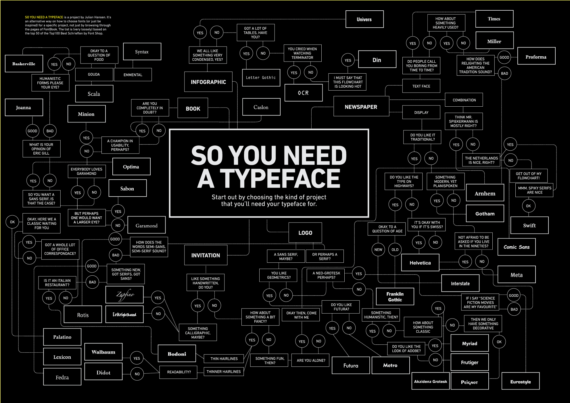
The FontShop has created the perfect educational guide. From the dos and donts to type selection this cheeky informative piece makes learning about typography playful.

Why settle for casual flirtation when looking for a long-lasting relationship? Finding the perfect match is easy if you know the rules. Meet Your Type will help you overcome common obstacles, and keep your heart thumping for your one true love: typography.


+ More typographie guides


6.18.2011

We Real Cool

4.19.2011

New In: Animal Font

Spread happiness among people with this playful app entitled Animal Font. It consists of creating animal shaped balloon typography inspired by current environment concerns. Buy it here.

Secret trick: try shaking it like a polaroid picture to create harmonious sounds.


Cuteness at its best!


 Bonus: 100% of the proceeds from sales of this app helps Japan.

12.23.2010

Reverting to Type

Reverting to Type exhibit will showcase the print work of 20 contemporary letterpress practitioners from around the world.


Where?
10th–24th Dec 2010 and 4th–22nd Jan 2011
Standpoint Gallery, 45 Coronet Street, London N1 6HD
Open daily 10AM–6PM


Reverting to Type from Lima Charlie on Vimeo.

11.09.2010

Branding 101


Can you guess the logos?

10.23.2010

The Quick Fox...

It is never too early or late to start learning your typefaces. This Typeface Memory Game is perfect for those wanting to be in the known. What's your favourite font?


Design: Brazilian studio PS2  Available at: Bis Publisher.

9.13.2010

Speak.

Aron Jancso | Typography

7.01.2010

Made in O' Canada

5.21.2010

Typography 101

4.07.2010

Sit on my words!


The 'Dharma Lounge' from Calgary based design firm, Palette Industries, does it for us. We love the clever use of typography, the choice of color and the brilliant ergonomics of the object.

2.10.2010

♥ You're Just My Type

“Baby, you’re my Univers. Meeting you was no Akzidenz. I can see that we've got a great Futura. We were Meta be together.”

Set of all four Just My Type greetings cards, designed to win the heart of the type-lover in your life.

Can we just say, pure cuteness for only £8.00 by Handmade by Machine!

1.13.2010

Trump Type


Type Trumps 2 are 30 game cards created by Rick Banks to illustrate various classic typefaces. Available at Face37 and priced for £9.99. That price includes worldwide shipping!


12.16.2009

WOW


12.03.2009

What's in the mail?

i

dentica
, a Montreal ad agency, will redesign Canada Post's mailbox. All over Canada, mail boxes will feature a typographic design of postal codes, cities and towns. I do not mail items often but this will at least brighten up any neighbourhood.


SOURCE

10.26.2009

Know your fonts: Mix n' Match


Remember the Match/Memory Game that we use to play when we were kids? Here is a modern day typographic version. Created by the Brazilian design studio ps.2, as a promo tool, it is accompanied by a typographical glossary and history of each font. Know your fonts and start the kids off young.

7.16.2009


R.I.P 1993-2008
The recent demise of Vibe magazine sounded the end of another musical era. Dubbed as the "Black Rolling Stone" by Wikipedia, it infused everything with hip-hop + soul as it ventured out into non-musical terrains.


We loved Vibe magazine. Not so much for the insightful articles but more so for their photographic + design + typographic styling that evoked wit, attitude and creative flair. The redesign, in 2008, only further solidify the praised it received in Print Magazine's 2004 Issue and by Pentagram.


There's always the online version of the popular Vibe magazine. It provides coverage of urban music and fashion, cars, and electronic gadgets.

Work: Editor-in-chief Danyel Smith, art director Mark Shaw, and photo editor Robyn Forest, Luke Hayman and Gary Koepke.

2.26.2009

Eco font

Less ink yet still legible. “Eco Sans” is a new green font created by Spranq, a Dutch communications firm. This font saves on printing ink by using less of it. Download yours here.
T

12.19.2008

Personality Type


You are?
a. a self promoter
b. cold hard steel
c. outlawed since 1941
d. bluntly subtle
e. no where to be found

Not sure? Well that all depends of your font preferences. Typocalypse on flickr has posted images based on this notion. Which font character are you?

P.S: I am somewhere between the son of a stonecutter (nice), a conformist (resent this) and a circle, a triangle + a square (can live with it).

T